SpilBar 51: We need to talk about your logo
Every icon, every color, every button and every logo tells a story, whether it’s an image of a fire-breathing dragon, a pure minimalist design or simply your company name written with Comic Sans. Your choice of font, color and shape sends a signal of who you are. Even when you’re not trying.
To help us decipher the all the small details, and understand their meaning, we have invited three experts in the field, Thomas Ryder, Lisa Sommer, and Michael Flarup to talk about Logos, UX, and App Icons. Together with them we look forward to dive into all the small details, and see the big picture in the small things.
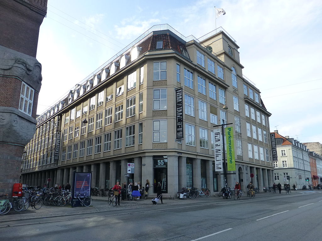
Program, SpilBar 51 @ Bio Asta – Cinemateket
16:30 Welcome
16:35 Logo Autopsies – Thomas Ryder
What does the roman numerals in the Hitman III logo express? Is Playdead’s logo brilliant or boring? And what’s up with the “D” in “Deep Rock Galactic”? Watch and learn the do’s and don’ts of logo design as Thomas Ryder dissects logos from the Danish game industry.
17:10 Coffee Break
17:30 The UX of Icons – Lisa Sommer
Icons may seem like the perfect choice when it comes to communicating instantly or saving screen space, but in some cases they can lead to misunderstandings and confusion. Follow Lisa on a journey through cultural clashes and iconic misconceptions. And learn about the best icon from a user experience perspective.
17:55 ICONIC! – Michael Flarup
Hi, my name is Michael 👋 and I simply love app icons — they continue to be everything that excites me about visual design. For 4 years I’ve been working on a book that celebrates the art and craft and the golden age of icon design that has lived and evolved on our devices this past decade. In this talk, I’ll be giving you the highlights of successful app icon creation, with examples from both apps and games.
18:15 Announcements, info, open mike
18:30 Mingling & refreshments
About the speakers

Thomas Ryder is co-owner of Italic, and is the art director, graphics artist and musician on their upcoming adventure game “Midnight Girl”. He has specialized in making atmospheric point-and-click adventures, and is perhaps best known for the time travelling sci-fi thriller “The Silent Age”. Thomas usually combine a flat 2D art style with eerie synths to achieve a style which he describes as ‘moody minimalism’. Thomas also struggles with a lifelong addiction to logos, typography and user interface, and usually make both logos and custom typography for his own games.
 From Johannesburg to Stockholm, Lisa Sommer has observed how people react to different interfaces in user tests. With 20+ years of professional experience, she has developed a great understanding of what works from a user perspective and what doesn’t. Lisa is currently Senior User Experience Architect at AKQA, an international design and innovation company with offices in 20 countries
.

Michael Flarup is a game- and graphics designer and CEO of game studio Northplay. He started making things on his computer in his teens in the late 90s and hasn’t stopped since. Michael’s career of pursuing fun in what he does has led him to run companies and initiatives that have produced products, apps, services, events and games that have been experienced by millions of people.
About SpilBar: SpilBar is operated by Vision Denmark in collaboration with the Danish National Film School. The SpilBar format was developed by Interactive Denmark, Thomas Vigild and DADIU, represented by Kristine Ploug.
The logo is designed by Pernille Sihm.
Join SpilBar’s Facebook group here.
Join the mailinglist and receive mails about SpilBar events here
SpilBar is supported by the Game Funding Scheme under the Danish Film Institute and Danish Board of Business Development
![]()
![]()


Sorry, the comment form is closed at this time.